
You’ve probably noticed that most smart home dashboards feel cluttered and confusing, making you wonder why controlling your connected devices has to be so complicated. The secret isn’t about cramming more features onto your screen—it’s about understanding the subtle design principles that transform chaos into clarity. When you master these specific techniques, your dashboard becomes an extension of your thinking rather than an obstacle to it.
Understanding Your Smart Home Dashboard Ecosystem
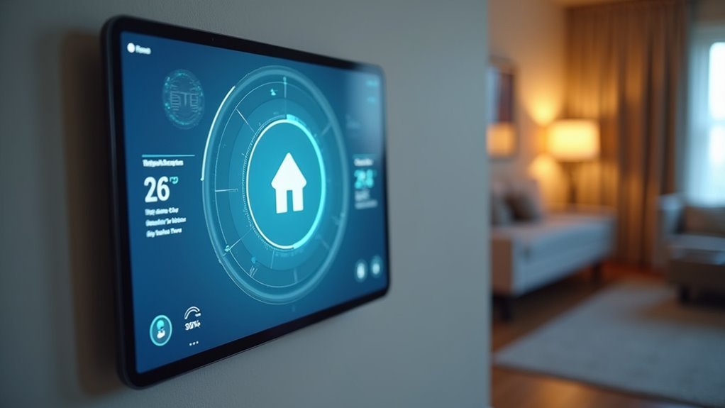
When you step into the world of smart home automation, your dashboard becomes the command center that transforms scattered devices into a cohesive, manageable system.
Your smart home dashboard serves as the centralized interface where lighting, security systems, and climate controls converge into one accessible platform.
Understanding this ecosystem means recognizing how each component interacts within your dashboard design. You’ll customize cards to display specific functionalities—adjusting brightness, monitoring temperature, or receiving security alerts.
The user experience depends on how effectively you organize these elements.
Your dashboard’s mobile optimization guarantees you’re connected wherever you go, while customizable themes and layouts let you arrange information according to your preferences.
This ecosystem isn’t just about control—it’s about creating an intuitive environment.
Essential Components for Maximum Control
Although your smart home ecosystem may contain dozens of connected devices, your dashboard’s effectiveness relies on five essential components that deliver maximum control without overwhelming complexity.
Your dashboard layout should prioritize customizable cards that you’ll arrange based on personal preferences. These cards provide quick access to lighting, temperature, and security controls. Real-time data visualization keeps you informed through live camera feeds and instant security alerts.
| Component | Function |
|---|---|
| Customizable Cards | Lighting & temperature control |
| Real-time Updates | Security alerts & camera feeds |
| Sensor Integration | Energy & environmental monitoring |
Smart devices generate valuable sensor data for temperature, humidity, and energy consumption insights. A streamlined navigation system enables quick access to specialized sub-dashboards, while minimalist design principles guarantee essential controls remain visually accessible without cluttering your interface.
Responsive Design Principles for Multi-Device Access
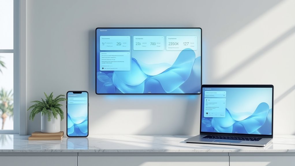
Since your smart home dashboard needs to function flawlessly across everything from your smartphone to a wall-mounted tablet, implementing responsive design principles becomes vital for maintaining consistent control.
You’ll want to utilize fluid grid layouts that resize elements proportionally, making sure your dashboard maintains both functionality and visual appeal regardless of screen size.
Media queries become your best friend here, allowing you to apply specific styles based on each device’s resolution and orientation. This guarantees critical information stays visible and accessible.
Don’t forget to implement touch-friendly elements like larger buttons and interactive cards—they’ll dramatically improve your user experience on mobile devices.
Testing across multiple devices is essential for identifying usability issues and securing seamless multi-device access throughout your smart home ecosystem.
Color Psychology and Visual Hierarchy Strategies
You’ll transform your smart home dashboard’s effectiveness by implementing strategic color psychology and visual hierarchy principles.
Your device status indicators should use intuitive color coding—green for normal operation, yellow for alerts, and red for critical issues—while maintaining sufficient contrast ratios to guarantee accessibility for all users.
You must balance visual weight across your interface by positioning the most important controls prominently and using size, color intensity, and spacing to guide users’ attention naturally through the dashboard.
Color-Coded Device Status
When designing your smart home dashboard, color becomes one of your most powerful tools for instant communication. A well-implemented color-coded system lets you scan device statuses instantly—green signals everything’s running smoothly, while red alerts you to problems requiring immediate attention.
This visual hierarchy dramatically improves your response times when issues arise. You’ll want bright, contrasting colors like yellow or red for critical notifications that demand quick action.
Consistency is key: always use the same colors for identical statuses across your entire dashboard. This builds user recognition and reduces cognitive load.
Don’t forget to gather user feedback on color preferences and meanings. What feels intuitive to you might confuse others, so testing guarantees your dashboard communicates effectively with everyone who’ll use it.
Contrast for Accessibility
While color-coding provides instant visual feedback, proper contrast guarantees your dashboard remains accessible to users with varying visual capabilities. High contrast between text and background colors guarantees everyone can easily distinguish critical information, regardless of their visual abilities.
You’ll create effective contrast for accessibility by implementing these strategies:
- Meet minimum standards – Maintain at least 4.5:1 contrast ratio for normal text and 3:1 for large text.
- Establish visual hierarchy – Use color intensity and placement to guide attention to priority elements.
- Test thoroughly – Utilize online contrast checking tools to verify your color combinations meet accessibility guidelines.
Smart contrast choices don’t just improve accessibility—they enhance overall usability. When you prioritize high contrast design, you’re guaranteeing your dashboard communicates effectively with all users while maintaining its sleek aesthetic appeal.
Visual Weight Balance
Balance transforms your smart home dashboard from a chaotic collection of widgets into an intuitive command center that naturally guides users’ eyes to what matters most. Achieving visual weight balance requires strategic placement of elements based on their importance and visual impact. You’ll want to position critical controls and alerts where they naturally command attention, while supporting information takes secondary positions.
| Element Type | Visual Weight | Position Strategy | Color Approach | Purpose |
|---|---|---|---|---|
| Critical Alerts | High | Top/Center | Red/Orange | Immediate attention |
| Primary Controls | Medium-High | Upper third | Blue/Green | Quick access |
| Status Indicators | Medium | Mid-sections | Neutral tones | Information at a glance |
| Secondary Data | Low | Lower areas | Muted colors | Supporting context |
| Navigation | Low-Medium | Edges/Bottom | Consistent palette | Dashboard UX flow |
This approach guarantees ideal dashboard UX through intentional visual weight balance.
Real-Time Data Visualization Techniques
As you design your smart home dashboard, real-time data visualization becomes the bridge between raw device information and actionable insights. Live data feeds provide instant updates on device status, creating an engaging user experience that keeps you connected to your automation systems.
Three essential visualization techniques:
- Strategic color coding – Use red for alerts and green for normal operation to guarantee immediate recognition of critical information.
- Interactive controls – Incorporate sliders and toggles that let you manipulate data directly, adjusting temperature or lighting levels seamlessly.
- Trend visualization – Display real-time graphs showing energy consumption and temperature variations over time.
Visual feedback reinforces your confidence through brief animations or color changes when confirming commands, enhancing overall smart home management effectiveness.
Navigation Patterns That Actually Work
When you’re maneuvering through countless smart home controls, your dashboard’s navigation pattern determines whether you’ll accomplish tasks efficiently or abandon them in frustration.
Effective navigation patterns prioritize intuitive pathways that guide you to information without overwhelming complexity. You’ll benefit from established conventions like breadcrumb trails and clear labels that match your expectations.
Strategic whitespace reduces visual noise, letting you focus on essential actions rather than fighting distractions.
Consistent placement of menus and buttons across different views builds familiarity, enhancing your user experience markedly.
When you interact with controls, feedback mechanisms like highlights or subtle animations confirm your choices, boosting confidence in your navigation decisions and creating a seamless smart home management experience.
Customizable Widget Architecture
Your dashboard’s navigation foundation sets the stage for the next layer of personalization: widgets that adapt to your unique smart home routine.
Customizable widgets transform your interface from generic to genuinely useful, letting you prioritize what matters most in your daily interactions.
Personalized widgets eliminate interface clutter by surfacing only the controls and information that align with your specific lifestyle patterns.
Here’s how smart widget architecture enhances your smart home experience:
- Pre-built essentials – Access lighting controls, thermostat adjustments, and security monitoring through ready-made widgets that handle common tasks efficiently.
- Community expansions – Install custom widgets created by other users, extending functionality beyond standard offerings and adding specialized features.
- Flexible layouts – Arrange widgets in varying sizes across smartphones and tablets, creating visual appeal while maintaining ideal functionality for each device’s screen real-estate.
Performance Optimization for Seamless Operation
While customizable widgets provide the personalized interface you need, their true potential emerges only when your dashboard operates at peak performance.
You’ll achieve ideal performance optimization by minimizing active screen components, reducing load times considerably. Implement webhooks or MQTT protocols for efficient real-time data retrieval without network overload.
Monitor CPU and memory usage regularly to identify bottlenecks and allocate resources effectively. Cache frequently accessed user information to eliminate latency and accelerate access speeds.
Your dashboard must perform consistently across various devices—test on different screen sizes to guarantee uniform responsiveness and loading times.
These strategies transform your smart home interface from functional to exceptional, delivering the seamless operation that makes controlling your connected home effortless and intuitive.
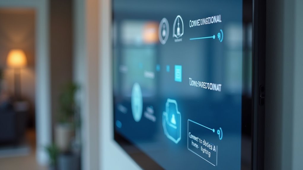
Security Integration Without Compromising Aesthetics
You don’t need to sacrifice your dashboard’s sleek design to incorporate robust security features into your smart home interface.
Hidden camera feeds can be elegantly tucked behind minimalist tiles that expand on demand, while seamless alarm controls blend into your existing layout using subtle color coding and intuitive icons.
This approach guarantees you’ll maintain visual harmony while keeping critical security functions just a tap away.
Hidden Camera Feeds
Modern smart home dashboards face a critical challenge: displaying thorough security feeds without creating visual chaos.
You’ll want to integrate hidden camera feeds seamlessly into your interface while maintaining that visually appealing aesthetic you’ve worked hard to achieve.
Smart security monitoring doesn’t mean sacrificing style. Here’s how you can balance functionality with design:
- Customizable card layouts – Prioritize critical camera feeds and position them strategically for quick access without overwhelming your dashboard’s clean look.
- Adaptive color indicators – Use red for alerts and green for active status, giving you instant security condition updates at a glance.
- Real-time alert configuration – Set up notifications for unusual activity that won’t disrupt your dashboard’s minimal design philosophy.
You’ll maintain security effectiveness while preserving visual elegance.
Seamless Alarm Controls
Although security systems traditionally required bulky control panels that disrupted home aesthetics, today’s smart dashboards transform alarm controls into elegant, intuitive interfaces.
You’ll achieve seamless integration by implementing single-tap arming and disarming functions that eliminate complex button sequences.
Your dashboard should utilize strategic visual cues like subtle color changes and clean alerts to communicate security status without creating visual clutter.
Real-time notifications keep you informed of breaches and system changes while maintaining your interface’s sleek appearance.
Customizable cards let you prioritize essential security features, ensuring critical functions remain easily accessible.
You can arrange these elements to match your preferences while preserving design cohesion.
Minimalist themes allow security controls to complement your overall aesthetic, creating a unified experience that doesn’t sacrifice functionality for style.
Voice Command Interface Design
When designing a voice command interface for your smart home dashboard, natural language processing capabilities form the foundation of an intuitive user experience.
You’ll need robust NLP algorithms that accurately interpret user intent and deliver contextually appropriate responses.
Essential design elements include:
- Audio feedback confirmation – Provide clear auditory cues that reassure users their commands have been recognized and executed successfully.
- Contextual awareness integration – Enable your interface to respond intelligently based on current room location, time of day, and user preferences.
- Multi-language support – Accommodate diverse users by incorporating multiple languages and dialects for broader accessibility.
Implement continuous learning algorithms that adapt to individual speech patterns over time.
This personalization creates a more efficient interaction experience, allowing your voice command interface to evolve with each user’s unique communication style.
Automation Rule Visualization
Your smart home’s automation rules need clear visual representation so you can understand how your devices interact and respond to different conditions.
You’ll want to see trigger-action relationships mapped out in intuitive flowcharts that show exactly what happens when specific events occur in your home.
Real-time status indicators become essential for monitoring whether your automation rules are active, triggered, or experiencing issues that need your attention.
Visual Rule Mapping
Since automation rules form the backbone of any smart home system, you need a clear way to visualize how they work together.
Visual rule mapping transforms complex home automation into intuitive flowcharts and diagrams that show exactly how your devices interact. This approach delivers vital user information through graphical representations that make troubleshooting and optimization straightforward.
Effective visual rule mapping includes three essential elements:
- Color-coded status indicators that instantly show whether rules are active, inactive, or experiencing errors
- User-friendly icons and symbols that simplify complex processes for non-technical users
- Real-time visualization of automation outcomes like lights activating or temperature changes
These visual tools provide immediate feedback, reinforcing your confidence in the system’s performance while making management effortless.
Trigger-Action Flow Display
Although automation rules can seem abstract and complex, trigger-action flow displays transform them into clear, visual pathways that show exactly how your smart home responds to different events.
These flowcharts use intuitive icons and color coding to illustrate relationships between triggers like motion detection and actions such as turning on lights. You’ll instantly grasp how components interact and react to stimuli in real-time.
Interactive trigger-action flow displays boost user engagement by letting you modify automation rules directly from the dashboard. You can add, edit, or delete rules with simple clicks.
Real-time feedback within these visualizations builds confidence in your setup while alerting you to any automation failures, ensuring your smart home operates smoothly and efficiently.
Real-Time Status Indicators
When automation rules execute behind the scenes, real-time status indicators serve as your smart home’s pulse, instantly revealing which devices are active, which conditions are being monitored, and how your system responds to environmental changes.
Effective automation rule visualization transforms complex data into digestible insights through:
- Color-coded feedback systems – Green indicates normal operations while red signals alerts requiring immediate attention, creating instant visual recognition of your home’s status.
- Dynamic status updates – Your dashboard refreshes automatically when conditions change, delivering timely notifications about security events or energy consumption spikes.
- User-friendly icons paired with indicators – Intuitive symbols alongside real-time data enable quick device recognition and streamlined system management.
These visual elements eliminate guesswork, helping you understand exactly how triggers interact with devices and maintain complete control over your automated environment.
Troubleshooting Display Issues and User Feedback
Even the most carefully designed smart home dashboards can encounter display problems that frustrate users and undermine the system’s effectiveness.
You’ll face common issues like screen flickering, unresponsive touch inputs, and incorrect data rendering caused by software bugs or hardware malfunctions.
When troubleshooting display issues, you can’t rely solely on testing phases—user feedback becomes your most valuable diagnostic tool.
Implement quick reporting buttons and surveys to gather insights about display information problems users experience.
You should schedule regular software updates and maintenance to guarantee compatibility with latest firmware while fixing known bugs.
Don’t forget to test thoroughly across different devices and environments before deployment.
This proactive approach helps you identify potential display issues early, maintaining smooth performance and user satisfaction.
Frequently Asked Questions
What’s the Average Cost to Develop a Custom Smart Home Dashboard?
You’ll typically spend $15,000-$50,000 developing a custom smart home dashboard. Your costs depend on features, platform complexity, and developer expertise. Simple versions start around $10,000, while enterprise-level solutions can exceed $100,000.
Which Programming Languages Work Best for Building Dashboard Interfaces?
You’ll find JavaScript with React or Vue.js works excellently for responsive interfaces. Python’s Django handles backend processing smoothly, while Swift and Kotlin create native mobile apps. TypeScript adds reliability to larger projects.
How Do I Backup and Restore My Dashboard Settings?
You’ll need to export your settings through the dashboard’s admin panel, save the configuration file to cloud storage or external drive, then import it back when restoring your customized layout and preferences.
Can Third-Party Smart Devices Integrate With Any Dashboard Platform?
You can’t integrate every third-party device with all dashboard platforms. Compatibility depends on supported protocols like Zigbee, Z-Wave, or WiFi. You’ll need to check each platform’s compatibility list before purchasing devices.
What Happens to My Dashboard When Internet Connectivity Fails?
Your dashboard typically switches to offline mode when internet fails. You’ll lose cloud-based features and remote access, but local device controls often remain functional through cached data and direct network connections.
Leave a Reply