
You’re staring at a cluttered mess of IoT data that’s supposed to make your smart home easier to manage, but instead it’s creating more confusion than convenience. Your dashboard displays everything from doorbell notifications to thermostat readings in a chaotic jumble that forces you to hunt for critical information when you need it most. There’s a better way to organize this digital chaos that’ll transform your home monitoring experience.
Prioritize Critical Home Metrics at Dashboard Entry Points
When you first open your home IoT dashboard, the most critical information should immediately catch your eye. Place essential home automation metrics like security status, energy consumption, and temperature at the top for quick visibility.
Use visual hierarchy through larger fonts and distinct colors to emphasize these dashboard components and enhance user experiences.
Leverage bold typography and contrasting color schemes to create clear visual distinctions that guide users naturally through dashboard priorities.
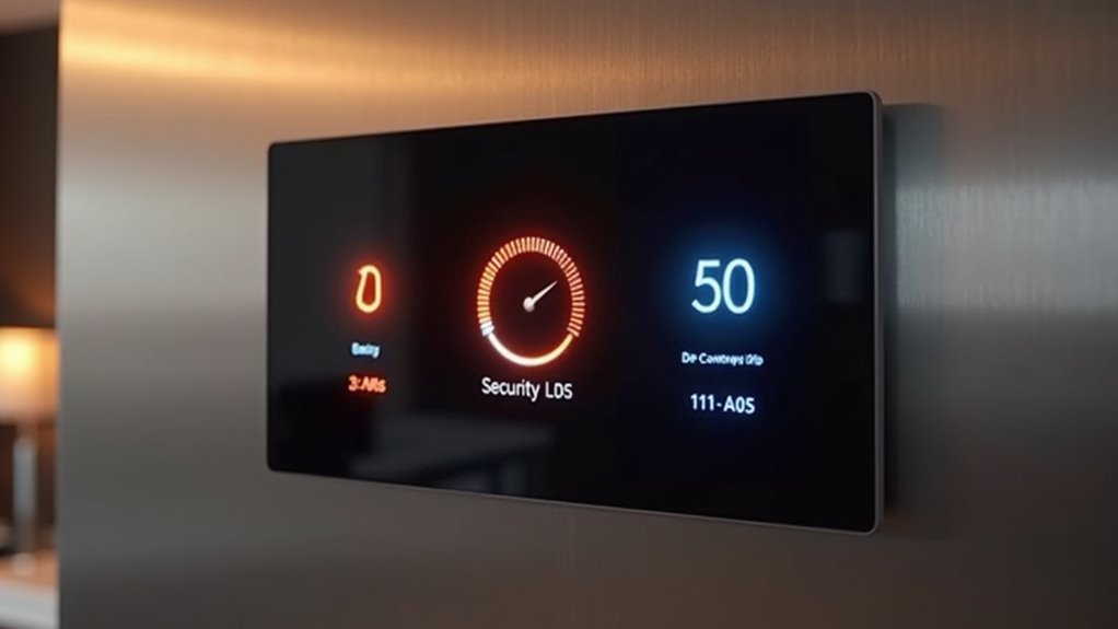
Position alerts for anomalies—unusual energy spikes or security breaches—prominently near the top so you can respond swiftly. Ascertain KPIs related to device connectivity and system health remain easily accessible for timely decision-making.
Incorporate real-time monitoring capabilities for critical metrics, enabling effective home environment oversight.
Effective data visualization of these priority elements supports informed adjustments and keeps your most important home systems visible at entry points.
Group Related Smart Home Data for Intuitive Navigation
Since your home contains dozens of interconnected devices, you’ll maneuver more efficiently by clustering related data into logical groups.
Smart home dashboard visualization becomes intuitive when you organize IoT information by function rather than device location.
Here’s how to structure your monitoring interface:
- Environmental controls – Group temperature, humidity, and air quality data from multiple sensors into one all-encompassing climate section.
- Security overview – Combine door locks, cameras, and alarm status into a unified visual format for complete safety monitoring.
- Energy management – Consolidate consumption metrics from all connected devices into expandable tabs.
Color-coded groupings enhance visual recognition, allowing users to quickly identify which areas need attention.
This approach transforms overwhelming device lists into manageable clusters, helping you focus on specific home systems without maneuvering through multiple dashboard screens.
Select Appropriate Visualization Types for Different Device Categories
While grouping devices logically streamlines navigation, you’ll maximize dashboard effectiveness by matching each device category with its most suitable visualization format.
Smart lighting requires simple toggle buttons and sliders for brightness and color adjustments, creating intuitive user experiences.
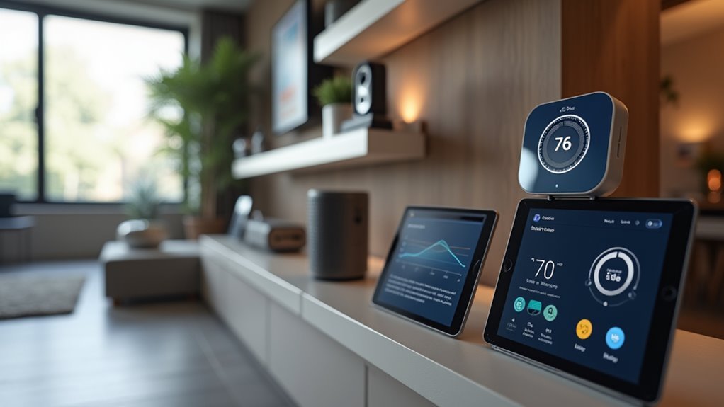
For thermostats, implement line graphs to display temperature trends, enabling users to track patterns and optimize settings.
Security cameras need grid layouts showing multiple feeds simultaneously, helping you monitor your property effectively.
Smart appliances work best with progress bars or circular gauges representing operational status like wash cycles.
Energy consumption data from smart meters benefits from bar charts comparing usage trends.
These visualization types guarantee your interactive dashboards present real-time data clearly, empowering users to make informed decisions about their IoT devices through proper data representation.
Implement Real-Time Alerts for Home Security and Safety Systems
Although visual clarity forms the foundation of effective IoT dashboards, real-time alerts transform your home security and safety systems into proactive guardians that instantly notify you of critical situations.
Real-time alerts transform IoT dashboards from passive monitors into proactive guardians that instantly notify you of critical situations.
Smart devices integrated with real-time data visualization enable users to monitor their property remotely while preventing information overload through strategic alert configuration.
Your user-friendly dashboard should implement these essential alert features:
- Motion sensor triggers that distinguish between routine activity and unauthorized access, sending immediate notifications to your smartphone.
- Smoke and carbon monoxide detector integration that delivers critical safety alerts instantly.
- Urgency-based categorization that helps you prioritize responses effectively.
Effective IoT monitoring requires dashboard elements that consolidate important data from multiple sources, ensuring you receive alerts without overwhelming your interface with unnecessary notifications.
Customize Layout Based on Daily Usage Patterns and Family Workflows
Because each family operates on unique schedules and routines, your IoT dashboard’s effectiveness depends on how well it adapts to these natural patterns rather than forcing users to conform to a generic interface.
Start by analyzing your family workflows to identify peak usage times for different devices and systems. Configure your dashboard layout to prioritize features that align with daily routines—place security controls prominently for morning checks and energy metrics for evening reviews.
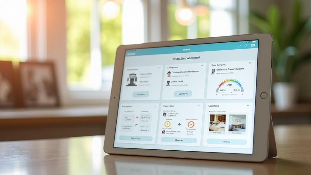
Implement customizable widgets that provide quick access to frequently used functions. Use color coding to categorize devices by family member or room location, making identification effortless.
Create a favorites section where each person can save their most-used features. This strategic arrangement helps streamline interactions and guarantees your dashboard serves your family’s specific needs efficiently.
Frequently Asked Questions
What Color Schemes Work Best for Iot Dashboards in Different Lighting Conditions?
You’ll want high-contrast dark themes for bright daylight viewing and softer, warm color palettes for evening use. Blue-based schemes reduce eye strain during nighttime monitoring, while amber accents improve readability across varying conditions.
How Can I Make My Dashboard Accessible for Family Members With Disabilities?
You’ll need larger text sizes, high contrast colors, voice commands, and screen reader compatibility. Add keyboard navigation shortcuts, customizable font options, and audio alerts for status changes to accommodate various disabilities.
Which Dashboard Platforms Offer the Best Integration With Popular Smart Home Devices?
You’ll find Home Assistant and OpenHAB provide excellent compatibility with most smart devices. SmartThings and Hubitat also integrate well with popular brands. Node-RED offers flexible custom integrations if you’re comfortable with visual programming.
How Much Bandwidth Does a Real-Time Iot Dashboard Typically Consume?
You’ll typically see real-time IoT dashboards consuming 1-5 Mbps of bandwidth, depending on your device count and update frequency. Simple text-based dashboards use less, while video feeds dramatically increase consumption.
Can I Access My Home Iot Dashboard Securely When Traveling Abroad?
You can access your dashboard abroad using VPN connections, HTTPS encryption, and two-factor authentication. Check your router’s security settings, use strong passwords, and consider cloud-based platforms with built-in security features.
Leave a Reply