
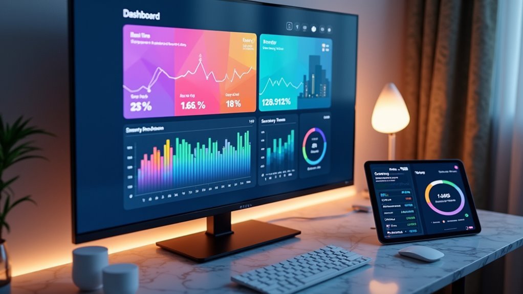
You’re drowning in smart home data from sensors, thermostats, and security cameras, but you can’t make sense of what it’s telling you. The numbers stream in constantly—temperature fluctuations, energy usage spikes, motion detection alerts—yet they remain scattered across different apps and interfaces. Without proper visualization tools, you’re missing critical patterns that could optimize your home’s efficiency, security, and comfort. The right dashboard transforms this chaos into actionable insights that’ll change how you manage your space.
Understanding Home Automation Data Visualization Requirements
When managing a modern smart home, you’ll need visualization tools that can process real-time data streams from dozens of connected devices simultaneously.
Your data visualization tool must handle diverse data types, from energy consumption metrics to device availability and environmental conditions. This enables you to track performance trends and make informed decisions about your automation systems.
You’ll want customizable dashboards that display KPIs relevant to your specific goals, whether that’s energy savings or system responsiveness.
User-friendly interfaces are essential, especially when you’re not technically inclined. Your chosen tools should support filtering, sorting, and data export capabilities for thorough monitoring and control.
Additionally, ascertain compatibility with major protocols like Zigbee, Z-Wave, and Wi-Fi for seamless device integration.
Tableau for Smart Home Analytics and Reporting
Tableau’s powerful analytics engine transforms your scattered smart home data into compelling visual stories that reveal hidden patterns in device behavior and energy consumption.
You’ll create interactive dashboards that provide real-time insights into your home automation performance, tracking everything from thermostat efficiency to lighting usage patterns. The platform’s seamless data integration capabilities connect with smart plugs, sensors, and other IoT devices, centralizing your information for thorough analysis.
You can leverage Tableau’s dynamic data visualization features to monitor key performance indicators, identifying peak usage times and optimizing energy efficiency across rooms.
Advanced filtering and sorting functions let you drill down into specific datasets, while intuitive charts and graphs help you communicate findings effectively to family members or contractors making smart home automation investment decisions.
Grafana’s Real-Time Monitoring Capabilities
You’ll find Grafana excels at providing real-time visibility into your home automation systems through its powerful monitoring capabilities.
Setting up live dashboards lets you track energy consumption, device performance, and environmental metrics as they happen across your connected devices.
Configuring real-time alerts guarantees you’re immediately notified when critical thresholds are exceeded or when your smart home systems experience anomalies.
Live Dashboard Configuration
Although setting up static dashboards provides valuable insights, Grafana’s true power emerges when you configure live dashboards that update in real-time.
You’ll configure data sources like InfluxDB to stream sensor data continuously, enabling real-time monitoring of your home automation systems. Grafana’s visualization features let you select from various chart types, including line graphs and heatmaps, that automatically refresh with incoming data.
You can create customizable dashboards that display multiple panels simultaneously, showing energy consumption, device performance, and system statuses.
Configure refresh intervals to control how frequently your live dashboards update. Set up alerts and notifications to trigger when metrics exceed predefined thresholds, ensuring you’re immediately informed about any anomalies or critical issues requiring attention.
Real-Time Alert Setup
When your home automation systems generate continuous data streams, Grafana’s real-time alert setup becomes essential for maintaining peak performance and preventing system failures. You can configure alerts to monitor critical thresholds across multiple data sources, ensuring immediate notification when anomalies occur.
Setting up effective real-time alerts involves:
- Threshold Configuration – Define specific limits for energy usage, temperature ranges, and device status monitoring.
- Multi-Channel Notifications – Route alerts through email, SMS, or mobile apps for instant awareness.
- Conditional Logic – Create sophisticated alert rules that consider multiple variables before triggering notifications.
Your customizable dashboards integrate seamlessly with alert systems, providing extensive visualization of both current status and alert histories.
This combination enables proactive home automation management, helping you respond quickly to potential issues before they impact system performance.
Home Assistant Dashboard Configuration
Since Home Assistant’s dashboard serves as the central command center for your smart home ecosystem, configuring it effectively transforms how you interact with your connected devices.
You can visualize data from over 1,700 integrated devices and services through customizable drag-and-drop cards that represent various data points. The platform delivers real-time updates, ensuring immediate feedback on automation statuses for timely decision-making.
Real-time visualization across 1,700+ integrations provides instant automation feedback through intuitive drag-and-drop cards for smarter decision-making.
Customizable themes and layouts let you personalize your interface according to preferences while keeping critical information accessible.
Advanced automation capabilities enable you to create complex workflows that appear visually on your dashboard. This thorough configuration approach enhances operational efficiency by centralizing monitoring and control functions into one intuitive interface that adapts to your specific smart home requirements.
Power BI Integration With Iot Device Networks

While Home Assistant provides excellent local dashboard capabilities, Power BI extends your home automation visualization into enterprise-grade analytics by connecting directly to IoT device networks through specialized connectors.
You’ll harness Azure IoT Hub integration for seamless data import and real-time visualization of your smart home ecosystem.
Power BI’s data modeling capabilities let you create custom dashboards displaying KPIs and trends from connected devices. You can leverage:
- Real-time data streaming for instant monitoring and troubleshooting
- Advanced analytics with natural language queries and AI-driven insights
- Diverse visualization options including heatmaps and line charts for energy consumption patterns
These features transform complex IoT data into accessible, interactive dashboards.
You’ll identify device performance trends, optimize energy usage, and make data-driven decisions about your home automation systems with professional-grade analytics tools.
ThingsBoard Platform for Device Data Management
ThingsBoard revolutionizes device data management by offering an open-source IoT platform that seamlessly integrates with your home automation ecosystem through multiple protocols including MQTT, CoAP, and HTTP.
You’ll create customizable dashboards that visualize real-time data from all your connected IoT devices, providing instant insights into system performance and energy consumption patterns.
The platform’s advanced data visualization capabilities include charts, graphs, and automated alerts that help you monitor device status and identify trends or anomalies quickly.
You’ll appreciate the user-friendly drag-and-drop interface that makes creating visualizations accessible regardless of your technical expertise.
ThingsBoard efficiently manages data at scale, allowing you to handle numerous devices while maintaining high performance and reliability throughout your home automation network.
InfluxDB and Chronograf Time-Series Visualization
When you’re dealing with continuous streams of sensor data from your smart home devices, you’ll want a database specifically designed for time-series information like InfluxDB.
You can set up InfluxDB to efficiently store and query your IoT device measurements, from temperature readings to energy consumption patterns.
Once your database is running, you’ll create interactive dashboards in Chronograf that transform your raw data into meaningful visualizations for monitoring your home automation systems.
InfluxDB Database Setup
Since home automation systems generate continuous streams of sensor readings, device states, and performance metrics, you’ll need a database specifically designed to handle time-series data efficiently.
InfluxDB excels as a purpose-built solution that manages high write and query loads from your IoT devices, making it the ideal foundation for home automation visualization tools.
Setting up InfluxDB properly guarantees your real-time data flows seamlessly into advanced analytics workflows:
- Configure data retention policies to automatically expire old sensor data and prevent storage overflow
- Establish proper measurement schemas for different device types and sensor categories
- Implement authentication and security measures to protect your home automation data
Once configured, InfluxDB becomes your central repository for time-series data, enabling powerful visualization tools like Chronograf to transform raw sensor information into meaningful insights about your smart home’s performance.
Chronograf Dashboard Creation
After establishing your InfluxDB foundation, you’ll transform raw sensor data into actionable insights through Chronograf’s intuitive dashboard creation interface.
This powerful visualization tool streamlines the process of building custom real-time dashboards for your home automation system. You’ll drag and drop components to represent your IoT data effectively, choosing from line graphs, bar charts, and heatmaps that display key metrics like energy consumption and environmental conditions.
Chronograf’s alert system notifies you of significant anomalies in your data, enabling proactive management of your smart home devices.
Integration with the complete TICK stack guarantees thorough data collection and processing. You’ll gain a holistic view of your home automation performance through these sophisticated visualization tools, making complex IoT data accessible and actionable.
Node-RED Flow-Based Visual Programming
Node-RED transforms home automation data visualization through its intuitive flow-based programming approach that eliminates the need for complex coding.
Node-RED’s visual flow programming revolutionizes home automation by making powerful data visualization accessible without coding complexity.
You’ll drag and connect nodes in the browser-based editor to create powerful visual programming workflows that process real-time data from your IoT devices.
This platform excels at home automation visualization through:
- Protocol versatility – Supporting MQTT, HTTP, and other protocols for seamless device integration
- Dashboard integration – Built-in compatibility with Node-RED Dashboard and Grafana for thorough monitoring
- Community resources – Extensive library of pre-built nodes accelerating your development process
You’ll leverage cloud computing capabilities while accessing real-time data streams from multiple sources.
The visual programming interface makes Node-RED particularly valuable for creating sophisticated data visualization solutions without traditional programming expertise.
Kibana Elasticsearch Data Exploration Tools
You’ll find Kibana’s dashboard configuration capabilities vital for transforming your home automation data into meaningful visual representations that track energy consumption, device status, and system performance metrics.
Optimizing your Elasticsearch queries becomes essential when you’re handling large volumes of IoT sensor data, as efficient queries guarantee your visualizations load quickly and respond smoothly to user interactions.
Real-time data monitoring through Kibana lets you spot anomalies immediately, whether it’s a malfunctioning smart thermostat or unusual energy spikes that require your attention.
Kibana Dashboard Configuration
Configuration of Kibana dashboards transforms raw home automation data into meaningful visual insights that help you monitor and optimize your smart home systems.
You’ll leverage Elasticsearch integration to create dynamic dashboards displaying real-time data from your connected devices through various visualization formats.
Setting up effective Kibana data visualization requires strategic planning:
- Chart Selection – Choose appropriate visualizations like bar charts for device usage comparisons, line graphs for energy consumption trends, and pie charts for system performance breakdowns.
- Custom Queries – Build targeted aggregations to analyze device response times, energy patterns, and performance metrics specific to your home automation needs.
- Dashboard Design – Utilize Canvas tools to create visually appealing, customized layouts that present critical information clearly and can be shared across multiple monitoring devices.
Elasticsearch Query Optimization
When managing large volumes of home automation data, optimizing your Elasticsearch queries becomes essential for maintaining responsive dashboard performance and accurate real-time insights.
You’ll need to structure queries that efficiently filter device data by specific criteria like sensor types or time ranges. Using appropriate aggregations helps you visualize the data patterns without overwhelming system resources.
Focus on indexing strategies that support your most common query patterns, particularly when creating custom dashboards that monitor energy consumption or device status.
Well-optimized queries enable Elasticsearch to retrieve relevant data trends quickly, ensuring your real-time visualizations update smoothly.
This optimization directly impacts how effectively you can analyze automation metrics and respond to system changes promptly.
Real-time Data Monitoring
Since enhanced queries form the foundation for effective data retrieval, Kibana transforms raw Elasticsearch data into dynamic, real-time visualizations that bring your home automation metrics to life.
You’ll monitor continuous data streams from IoT devices instantly, enabling immediate responses to system changes and boosting operational efficiency.
Kibana’s real-time monitoring capabilities deliver extensive insights through:
- Custom dashboards featuring graphs, charts, and maps that update automatically as new data arrives
- Powerful filtering tools that let you drill down into specific metrics like energy usage or device performance
- Large-scale data handling that efficiently processes numerous IoT device streams without performance degradation
You can visualize trends, track anomalies, and maintain ideal home automation performance through Kibana’s intuitive interface that refreshes data continuously.
Custom Web-Based Dashboard Development Solutions
Although pre-built visualization tools offer convenience, custom web-based dashboard development solutions provide unmatched flexibility for your home automation data needs.
You’ll gain complete control over your data visualization interface, integrating seamlessly with IoT technology through protocols like MQTT and HTTP for ideal real-time data processing.
Custom dashboards enable sophisticated user interaction through filtering and sorting capabilities, making complex automation metrics digestible.
You can leverage platforms like Grafana or Tableau to create dynamic interfaces displaying energy consumption, device status, and response times.
These solutions connect with popular automation platforms like Home Assistant and SmartThings through APIs, ensuring seamless integration across all connected devices.
Your tailored dashboard becomes a thorough monitoring hub, transforming raw IoT data into actionable insights for optimizing your smart home environment.
Mobile Applications for Remote Data Monitoring
Why settle for desktop-bound monitoring when mobile applications transform your smartphone into a powerful remote control center for your home automation data? These apps deliver real-time data visualization from your IoT devices, letting you monitor and control everything from anywhere.
Popular mobile applications like Google Home and Amazon Alexa offer customizable dashboards that display device status and environmental conditions instantly. You’ll receive alerts and notifications when sensors detect changes, ensuring you can respond quickly to potential issues.
Key considerations for mobile remote data monitoring include:
- Connectivity options: Wi-Fi apps provide broader access than Bluetooth-limited solutions
- Integration capabilities: IFTTT compatibility enables automated responses to data triggers
- User interface: Intuitive dashboards enhance your ability to interpret complex home automation data effectively
Cloud-Based Visualization Services and Platforms
When your home automation system generates massive amounts of data, cloud services provide the scalable infrastructure you need to transform raw sensor readings into actionable insights.
Arduino Cloud delivers customizable interactive dashboards that enable real-time monitoring and control of your IoT devices from anywhere. Grafana creates visually appealing displays that integrate seamlessly with time-series databases like InfluxDB for effective data visualization.
Arduino Cloud and Grafana transform complex IoT sensor data into intuitive, real-time dashboards accessible from any location worldwide.
These platforms offer historical data analysis capabilities, letting you track performance metrics and identify trends in your automation systems.
Home Assistant supports over 1,700 products with dynamic visualizations reflecting current device status. Cloud-based services guarantee your data’s securely backed up and easily retrievable, enabling continuous monitoring without complex local infrastructure requirements.
Open Source Tools for DIY Implementation
While cloud-based solutions offer convenience, open-source platforms provide complete control over your home automation data visualization without recurring subscription costs or vendor lock-in concerns.
Home Assistant leads the pack, supporting over 1,700 IoT devices with extensive integration capabilities. You’ll find Grafana exceptional for creating customizable dashboards that visualize data from time-series databases like InfluxDB, enabling sophisticated real-time monitoring.
Node-RED offers intuitive flow-based development through its web interface, making data manipulation accessible even for beginners.
Consider these powerful open-source combinations:
- Home Assistant + Grafana: Integrate devices seamlessly while building professional-grade visualization dashboards
- Node-RED + InfluxDB: Create automated data flows with robust storage and retrieval capabilities
- OpenHAB + Domoticz: Combine flexible device support with extensive environmental monitoring features
These tools give you unlimited customization potential without subscription limitations.
Selecting the Right Visualization Tool for Your Setup
You’ll need to evaluate whether your chosen tool works seamlessly with your existing IoT devices and protocols like Zigbee or Z-Wave.
Consider if you require real-time data updates for effective monitoring and control of your automated systems.
Your technical expertise will determine whether you’re comfortable with complex setup processes or need user-friendly platforms with simplified integration capabilities.
Device Compatibility Assessment
Before diving into specific visualization tools, you must evaluate whether your chosen solution can actually communicate with your existing smart home devices. A thorough device compatibility assessment guarantees your visualization platform can collect data from all connected systems.
Start by cataloging your devices’ communication protocols:
- Protocol Support: Verify the tool supports Zigbee, Z-Wave, and Wi-Fi protocols used by your devices.
- Platform Integration: Check integration capabilities with existing hubs like Home Assistant or SmartThings.
- Data Flow Requirements: Confirm the tool handles real-time data updates from multiple device types simultaneously.
The most effective visualization tools offer custom dashboards with user-friendly interfaces that can interpret complex data trends across diverse device ecosystems.
Without proper compatibility, you’ll face data gaps that compromise monitoring effectiveness.
Real-Time Data Requirements
Once you’ve confirmed device compatibility, your focus shifts to understanding the real-time data requirements that’ll determine which visualization tool best fits your home automation setup.
You’ll need visualization tools that support low latency updates for monitoring device status instantly. This becomes critical when dealing with time-sensitive applications like security systems or HVAC controls where delays aren’t acceptable.
Your chosen platform should enable seamless data integration from multiple IoT protocols while maintaining real-time performance.
Tools like Grafana excel at creating custom dashboards that update continuously, letting you track key performance indicators without lag.
Consider the volume of data your connected devices generate and guarantee your visualization solution can process this information efficiently while delivering the immediate insights you need for effective home automation management.
Technical Skill Considerations
While your home automation setup might be cutting-edge, your technical expertise will ultimately determine which visualization tool you can effectively implement and maintain.
Some platforms demand extensive programming knowledge, while others offer user-friendly interfaces that accommodate beginners.
When evaluating technical skill level requirements, consider these factors:
- Programming complexity – Tools like Grafana require configuration knowledge, while drag-and-drop platforms minimize coding needs.
- Customization depth – Advanced customizability often correlates with steeper learning curves for creating interactive dashboards.
- Maintenance demands – Real-time data monitoring tools need ongoing adjustments that match your technical capabilities.
Choose visualization tools that align with your current skills rather than overestimating your abilities.
You’ll achieve better results with a simpler platform you can fully utilize than struggling with complex software that offers compatibility features you can’t properly configure.
Frequently Asked Questions
Which Tool Is Best for Data Visualization?
You’ll find Tableau’s the best overall data visualization tool because it transforms complex datasets into interactive dashboards. You can explore data deeply, create dynamic visuals, and gain actionable insights across various industries and applications.
What Is the Best Tool to Visualize Database?
You’ll find Tableau excels for database visualization with its robust connectivity options and intuitive interface. It handles complex queries efficiently while creating compelling visual stories from your raw data seamlessly.
Which Tool Is Most Commonly Used for Visualizing MIS Data?
You’ll find Tableau’s the most commonly used tool for visualizing MIS data. It transforms raw data into interactive dashboards and charts, letting you identify trends easily with its drag-and-drop interface.
What Is the Best Process Visualization Tool?
You’ll find Tableau stands out as the best process visualization tool because it offers superior data exploration capabilities, seamless integration with multiple sources, and robust interactive features for thorough analysis.


Leave a Reply