
You’re staring at a collection of disconnected smart devices scattered throughout your home, each requiring its own app and interface. Creating a unified dashboard that actually works isn’t just about throwing widgets onto a screen—it’s about understanding how your family interacts with technology daily. The difference between a frustrating digital mess and an intuitive control center lies in mastering specific design principles that most homeowners never consider.
Understanding Smart Home Dashboard Fundamentals

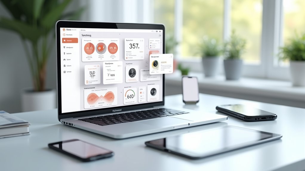
Since smart homes have become increasingly sophisticated, you’ll need a centralized hub to manage all your connected devices effectively. Smart home dashboards function as thorough control panels where you can monitor lights, thermostats, security cameras, and appliances through one streamlined user interface.
Your dashboard’s success depends on prioritizing user experience through clear visual hierarchies and intuitive navigation. This guarantees you can quickly access any device without confusion or delays.
A well-designed dashboard prioritizes intuitive navigation and clear visual organization to ensure seamless device access without confusion.
Customization plays a crucial role, letting you arrange layouts, widgets, and themes according to your specific preferences and lifestyle needs.
Real-time data updates are indispensable for maintaining current information about your home environment. These updates enhance both security monitoring and energy efficiency management, giving you immediate insights into your home’s status and helping you make informed decisions about your connected devices.
Essential Components for Home Automation Displays
When building your home automation dashboard, you’ll want to include four core components that form the foundation of effective smart home control.
Temperature control, lighting management, security monitoring, and energy consumption tracking create a thorough system overview that keeps you informed and in control.
Interactive elements like sliders for temperature and brightness adjustments enable real-time modifications directly from your interface.
These controls enhance user engagement and provide immediate feedback when making changes.
Data visualization through pie charts for energy usage and line graphs for temperature trends helps you interpret information quickly and spot patterns over time.
Built-in notifications alert you to security breaches or system malfunctions instantly.
Customizable layouts let you personalize themes and arrangements, improving both usability and visual appeal according to your preferences.
Customizable Widget Libraries for DIY Enthusiasts
While pre-built dashboard solutions offer convenience, customizable widget libraries empower you to craft truly personalized home automation interfaces that reflect your unique requirements and aesthetic preferences. These libraries provide extensive collections of charts and graphs, interactive elements, and data visualization tools that you can drag and drop into your dashboard layout.
| Widget Type | Functionality | Customization Level | Device Compatibility | User Engagement |
|---|---|---|---|---|
| Temperature Charts | Real-time climate monitoring | High | All devices | Interactive |
| Energy Graphs | Power consumption tracking | Medium | Mobile/Desktop | Visual feedback |
| Security Panels | Camera feeds and alerts | High | Touch screens | Immediate alerts |
| Lighting Controls | Smart bulb management | Medium | All devices | Touch controls |
| Weather Widgets | Forecast integration | Low | All devices | Informational |
You’ll maintain visual appeal through customizable colors, fonts, and responsive design principles that adapt seamlessly across different screen sizes.
Real-Time Data Integration and Sensor Monitoring
As your home automation system expands, real-time data integration becomes the backbone that transforms static dashboards into dynamic command centers.
You’ll need APIs to facilitate seamless information sharing between sensors and dashboard applications, enabling automated updates that keep your visuals current. Sensor monitoring collects data from various devices throughout your home, providing insights into performance metrics and environmental conditions that matter most to you.
Your dashboard’s key performance indicators will respond to live inputs, making it easier to analyze trends and spot anomalies quickly.
Visual Design Principles for Home Control Interfaces
Create an intuitive layout using recognizable icons and descriptive labels that work for all skill levels.
Your responsive design must adapt seamlessly across devices, from smartphones to tablets to wall-mounted displays.
Implement visual feedback through color changes and subtle animations when users interact with controls.
This approach transforms complex home automation into an engaging, efficient experience that encourages regular use.
Mobile-Responsive Dashboard Layouts
Since users access home automation dashboards primarily through mobile devices, you’ll need fluid grid systems that automatically adjust your interface elements across different screen sizes and orientations.
This mobile-responsive approach guarantees ideal usability whether someone’s controlling lights on a smartphone or adjusting temperature on a tablet.
Design touch-friendly elements with larger buttons and sliders to prevent accidental clicks. Follow WCAG 2.1 standards for color contrast ratios, ensuring accessibility across diverse lighting conditions and smaller screens.
Your text must remain readable everywhere.
Streamline navigation using hamburger menus and collapsible sections. This maintains clean interfaces while providing quick access to essential controls.
Test your layouts regularly on multiple devices and screen resolutions to identify usability issues and assure consistent experiences across all platforms.
Device Control Panel Configuration
When configuring your device control panels, you’ll want to establish a clear hierarchy that puts the most frequently used controls front and center.
Create a layout that makes navigation intuitive by positioning primary functions like lighting, temperature, and security controls prominently. Group related controls together—cluster all lighting switches in one section, HVAC controls in another, and security features separately. This organization reduces cognitive load and helps each user find what they need quickly.
Develop a consistent visual language throughout your panels using uniform icons, colors, and typography. Implement real-time status indicators to show device performance and connectivity.
Add customization options so users can rearrange controls based on their preferences and daily routines, making the interface truly personal.
Energy Management and Analytics Visualization
While device controls handle immediate automation needs, energy management dashboards transform raw consumption data into actionable insights that’ll help you optimize your home’s efficiency.
You’ll want to prioritize real-time data visualization that displays consumption patterns instantly. Interactive elements like sliders and toggles let you simulate different energy usage scenarios and forecast potential savings. Smart color coding highlights critical information—peak usage times and high-consumption areas—enabling quick decision-making.
Real-time visualization with interactive controls transforms energy data into actionable insights, enabling instant decision-making through smart color-coded consumption patterns.
Design user-friendly layouts that group related key metrics such as cost, usage, and projections. This organization enhances comprehension and streamlines energy performance analysis.
Don’t forget accessibility features like alt text for graphs and proper color contrast standards, ensuring your energy management interface remains usable for everyone in your household.
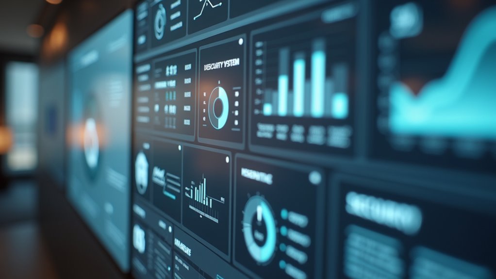
Security System Dashboard Elements
Although energy dashboards focus on efficiency optimization, security system dashboards demand an entirely different approach centered on threat detection and rapid response capabilities. Your dashboard must prioritize real-time monitoring with critical alerts and notifications ensuring immediate responsiveness to security incidents.
Design: best practices emphasize visual data representations including incident reports, threat levels, and system status indicators that enhance clarity and engagement.
Essential security dashboard elements include:
- Interactive maps providing geographic context for security events
- Customizable widgets allowing users to tailor displays to specific needs
- Real-time threat level indicators with color-coded severity levels
- Incident timeline tracking showing chronological security events
Usability improves through clear navigation features, proper labeling, and categorized metrics. These dashboard components foster efficient workflows while ensuring relevant security information remains prominently displayed for ideal threat management.
Smart Lighting and Climate Control Interfaces
You’ll need to create lighting and climate interfaces that feel natural and respond instantly to user commands.
Your temperature controls should display color-coded ranges and occupancy patterns, while your lighting management system must offer quick brightness and scheduling adjustments through simple gestures or voice commands.
Don’t overlook energy visualization features that show real-time usage data, helping you optimize both comfort and efficiency through clear, actionable insights.
Intuitive Temperature Control Design
When designing temperature control interfaces for smart home dashboards, you’ll want to prioritize clarity and responsiveness above all else. Your interface design should maximize usability through clearly labeled controls and immediate visual feedback.
Touch-friendly sliders work exceptionally well across mobile and desktop platforms, giving users seamless adjustment capabilities.
Real-time data visualization transforms your dashboard’s real estate into valuable insights. Display temperature trends through graphs that help users make informed decisions about their climate settings. Web analytics show that cohesive color schemes markedly improve navigation by signaling different temperature ranges.
Consider implementing these essential features:
- User-friendly presets for common temperature settings
- Touch-optimized sliders for precise adjustments
- Real-time trend graphs for informed decision-making
- Color-coded temperature ranges for instant recognition
Smart Light Management
Smart lighting interfaces transform how you interact with your home’s illumination by combining intuitive controls with intelligent automation features.
Your dashboards should display key data points like energy consumption, current brightness levels, and active scenes through clear visualizations. Effective application design incorporates dimming sliders, color temperature wheels, and preset scene buttons that respond instantly to user input.
Optimize usability by organizing controls into logical groups – basic adjustments, scheduling options, and energy monitoring.
Include real-time feedback showing how lighting changes affect power usage, helping you make informed decisions. Integration with climate systems allows coordinated adjustments that enhance comfort while reducing energy costs.
Design programmable routines that automatically adapt lighting based on occupancy patterns, time of day, and personal preferences for maximum convenience.
Energy Usage Visualization
Effective energy usage visualization transforms raw consumption data into actionable insights that help you reduce utility costs by up to 30%.
Your home dashboards should present this information using intuitive formats like color-coded bar graphs and pie charts that highlight peak usage periods. IoT sensors integrated into your smart lighting and climate systems enable detailed tracking of consumption patterns, revealing valuable trends over time.
User-friendly interfaces make complex energy data digestible at a glance, while predictive analytics forecast potential savings based on your historical usage.
Consider these essential visualization elements:
- Color-coded bar graphs for peak usage identification
- Pie charts showing energy distribution across systems
- Line graphs displaying consumption trends over time
- Predictive forecasts for optimization opportunities
Voice Assistant and IoT Device Integration
Anyone designing a modern home dashboard can’t ignore the transformative power of voice assistant integration. You’ll enhance user convenience dramatically by incorporating Amazon Alexa or Google Assistant into your interface design.
These voice assistants enable hands-free control over your entire smart home ecosystem through simple commands.
Your IoT devices become exponentially more valuable when they communicate seamlessly with your dashboard. Smart thermostats, security cameras, and sensors deliver real-time data that you can access instantly through voice queries or visual displays.
You’ll create inclusive experiences by prioritizing voice integration, especially for users with disabilities who benefit from audio interactions.
Machine learning algorithms help your dashboard learn preferences and automate routine tasks, while voice feedback provides audio confirmations that keep you informed without constantly checking screens.
User Permission Settings and Family Access Controls
While voice assistants provide powerful control over your smart home, you’ll need robust permission settings to guarantee family members access only the features and data appropriate for them.
User permission settings create secure boundaries that protect sensitive information while maintaining functionality for each household member.
Effective permission settings balance household security with seamless access, protecting privacy without sacrificing smart home convenience for family members.
Family access controls let you establish age-appropriate restrictions, ensuring children can’t access certain devices or view unsuitable content.
Customizable permission settings provide flexibility through various access levels:
- Read-only access – View data without modification capabilities
- Edit permissions – Modify specific settings and preferences
- Administrative rights – Full control over dashboard configuration
- Device-specific access – Control individual smart home components
Role-based access control streamlines management by automatically assigning permissions based on family member roles, creating an intuitive hierarchy that balances security with usability.
Dashboard Performance Optimization Techniques
As your smart home dashboard grows more complex with additional devices and data sources, performance optimization becomes critical for maintaining a responsive user experience.
You’ll want to minimize visual elements since each additional chart impacts load time and responsiveness. Implement lazy loading techniques to defer non-essential components until after primary elements render completely.
Focus on efficient data querying by aggregating data at the source and utilizing caching strategies to reduce database strain. Monitor performance metrics regularly using tools like Google Lighthouse to identify bottlenecks quickly.
Choose simple visualizations over complex alternatives—bar charts and line graphs perform better than 3D visualizations. These dashboard performance strategies guarantee your interface remains fast and responsive as your smart home ecosystem expands.
Troubleshooting Common Interface Design Challenges
Even well-planned home dashboard designs encounter common interface challenges that can frustrate users and reduce adoption rates.
You’ll need systematic troubleshooting approaches to identify and resolve these issues effectively. Start by gathering user feedback to understand their specific needs and pain points. This direct input reveals usability problems you might’ve missed during initial design phases.
Next, apply proven design principles like visual hierarchy and consistent layouts to create intuitive navigation experiences.
Here’s your troubleshooting framework:
- Conduct regular usability testing to observe real user interactions
- Implement WCAG 2.1 accessibility standards for inclusive design
- Track engagement metrics like session duration and feature adoption
- Analyze user behavior patterns to identify problematic interface elements
These data-driven insights help you pinpoint exactly where users struggle and guide targeted improvements.
Frequently Asked Questions
Which Is the Best Tool to Create Dashboards?
You’ll find Tableau excels for data visualization dashboards, while Justinmind’s perfect for interactive prototyping. Choose Tableau if you’re working with complex data, or Justinmind if you need detailed user interface design capabilities.
How to Design a UI Dashboard?
Start by defining your users’ primary goals and information needs. Create a clear visual hierarchy with consistent typography and colors. Use white space effectively, implement intuitive navigation, and test with real users for ideal usability.
Which Platform Is Best for Dashboard Design?
You’ll find Tableau’s your best choice for data-heavy dashboards, while Justinmind excels at user-friendly prototypes. Power BI offers excellent pre-made components, and Webflow provides superior customization for web-based interfaces.
Can Chatgpt Create Dashboards?
You can’t use ChatGPT to directly create visual dashboards, but it’ll help you brainstorm layouts, suggest data visualization techniques, recommend chart types, and guide you through design best practices for effective dashboard development.
Leave a Reply